Even if you employ a graphic designer, having the right language to explain what you’re looking for can improve your design briefs. Typography is so much more than just choosing the right font – often designers have much more control over the look of text than you might realise!
While there’s a lot to know about Graphic Design this will be the second post in a content series looking into different elements of design. This blog will show you some options for altering the text on a design – it’s not exhaustive but serves as a starting point.
Height:
When you type a word, most of the letters are the same height. The top of them is called the x-height, while the bottom is called the baseline. However, there are some letters that extend beyond the baseline or x-height, these are called descenders and ascenders, respectively.
For example, in the word ‘puddle’ the letters d and l will be ascenders and the letter p is a descender. The bottom of u, d, l and e create the baseline, while the tops of p, u and e create the x-height.
When you use capital letters, the letters will usually all be the same height, avoiding ascenders and descenders altogether. See: ‘DOG’ vs ‘dog’.
Spacing:
Letters:
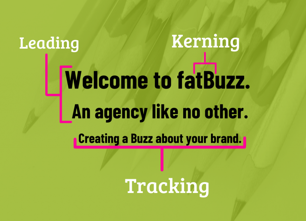
There are a few different ways to space text in a design. First there’s the tracking, which is the overall, uniformed spacing of letters within a word or paragraph. Second, there’s the kerning, which is the spacing between individual letters in a word.
These can be a bit confusing to understand, so here’s an example: in the word “kitten”, tracking will be the spacing from ‘k’ to ’n’ with a uniform spacing across all the letters between, whereas with kerning you might look specifically at altering the spacing between the letters ‘k’ and ‘i’.
Lines:
Finally, there’s leading which is the spaces between lines of text and might also be called line spacing. Lines that are too close together are often illegible as the descenders from the top line and ascenders from the line below tend to merge together.
When adjusting spacings, it’s a good idea to adjust your leading and tracking first, as they can mess up any kerning adjustments you’ve already made.

Layout:
The layout of your text isn’t so much to do with the font itself, but instead focuses on the overall look of the text in your design. When creating a block of text, you don’t want any words or lines left by themselves.
Just to make it confusing, there’s three different terms for explaining this same concept as it applies to different situations:
Runt:
When the last line of a paragraph has only part of a hyphenated word, has a very short line of text, or has a single short word. You can change the settings to not create hyphenated words, or look at adjusting the tracking of words to create a better distribution of words in your design.
Widow:
When the last line of a paragraph doesn’t fit on a page and then sits alone at the top of the next page. You might be able to fix this by adjusting the leading between lines, just be sure they don’t look too cramped.
Orphan:
When the first line of a new paragraph sits by itself at the end of the page, and the rest of the paragraph goes onto a new page. Usually, you can just hit enter one extra time to move that line down if necessary.
No matter how you want to name it, the point stands that leaving small bits of text isolated looks a bit odd in typography.
Style:
First, we’ll take a look at font styles. There are so many out there and each creates a different impression for the viewer. There’s handwriting fonts, calligraphic ones, and very artistic ones, but the most common font styles fall into two groups: Serif and Sans Serif.
Serif fonts:
These typically have little tick marks at the edges of letters. Take a look at the font ‘Times New Roman’ and you’ll see the little downward ticks on either side of the horizontal line on a capital ’T’. Those ticks make it a serif font.
Sans Serif fonts:
This style omits those ticks. Think of the font ‘Arial’ and you’ll see how none of the letters have those markings. Generally, sans serif fonts are considered to be more modern and minimal whereas serif fonts are more formal.
Often, sans serif fonts are used for large titles while serif fonts are used for smaller body copy, as most people find them easier to read than sans serifs.
Paragraph Styling:
The other styling you might look at is your paragraph styles. While right, left and centre aligning are well known, we wanted to quickly mention Justified text. When you select this option, the letter and word spacing is adjusted so that the text is aligned with both the left and right margins, creating straight lines at both edges.
This can be a useful tool if you need to create alignment with other shapes on the page.
Terrified by Typography?
A lot of times, you can choose an existing font and not need to make any adaptations to it. In fact, that’s the ideal situation!
However, if you love a font but something just doesn’t look quite right, hopefully you now have the right language to suggest adjustments to your designer.
If design is out with your skillset, not to worry. Whether it’s web, social graphics, or print, our dedicated team of designers can help. Get in touch today to find out how our fatBuzz can help you create a cohesive visual identity