Even if you employ a graphic designer, a real understanding of the basic visual principles can help to elevate your creations. If you know these concepts, it will help improve communication with your designer as you’ll have a clear idea of how to brief your ideas.
While there’s a lot to know about Graphic Design this will be the first post in a short content series looking deeper into different elements of design.
Making the Message Stand Out
Emphasis:
The driving question behind this principle is: ‘What is the major take away you want the audience to have?’ Once you know that, you can decide how to visually emphasize this point. It should stand out in some way so that the viewer is immediately drawn to it.
This can be done in a number of ways, some of which will be explored in detail further on, but the basic ways to give an extra visual weight to your important messages are through: size and proportion, colour, contrast, text formatting (bold, italics, etc), and visual guides/framing. For example, the biggest text is usually the most attention grabbing, and bright colours can stand out the most.
Before starting a design, it is important to know your key messages first, that way you can ensure they are the focal point.
Movement:
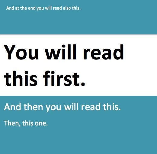
Movement the visual order that a viewer will follow when looking at a graphic design and it is closely connected to emphasis. The goal of a design will likely be that the emphasised part is seen first, but it is important that what the eye goes to next creates a sort of visual narrative.
The movement should be logical and help deliver the full message in a clear way. The concept of movement is easily summed up from the image below which has become a bit of a meme in the graphic design/UX community:

Contrast:
It may seem obvious, but the elements in a design need to be significantly different from the background. If the colours pop, it will stick in the viewers memory better. To that end, using opposing colours on the colour wheel can help with creating contrast when it comes to colours.
Contrast isn’t limited to colour though. It can also be thick vs thin text, modern vs traditional styles, big vs small and so on. Use contrast to give emphasis to important elements, but don’t use it so much that the graphic becomes confusing.
A great example of contrast that doesn’t have to do with colour would be the 1959 VW “Think Small” ads. The contrast of a small graphic on a big canvas emphasized their key message that the Beetle being a compact car.
Making the Message Easy to Follow:
Alignment:
On many design platforms and softwares, there’s now snap fits or guiding lines to help you see if elements are aligned with each other and where the centre point of a canvas is. These have made it infinitely easier to create graphics that look clean and ordered.
The Rule of Thirds can help with deciding image alignments and is often used in photography. Essentially it divides a photo into 3 horizontal and 3 vertical sections (creating 9 boxes on an image) and provides guidelines for where to place a photo to create an emphasis on specific parts of the image.
Balance & White Space:
This ensures that the design doesn’t feel too crowded. While an image that is symmetrical can create balance easily, asymmetry can also be used as long as there is an equilibrium. For example, one side of an image may have a single large graphic, while the other size has several small elements to compensate.
It’s also important to balance the ‘positive space’ and the ‘negative space’. Negative space is essentially your background or unused space and it is just as important as the space that is filled with elements. Using the negative space can help give attention to sections that matter the most as well as declutter a design.
Some brands also use their negative space to continue their message. The US Postal company FedEx is well known for this, using the negative space between ‘E’ and ‘X’ to create an arrow.

Repetition:
The last concept we’re going to look at is repetition, which can be used within a single design or across several different creatives. For example, using the same colours and phrasing will make a campaign look cohesive and using similar styles across several webpages or channels can help create a consistent brand identity. Repetition can help because a viewer will eventually be able to immediately recognise your brand, even when there’s no logo present, based on the repeated visuals.
Repetition used within a single design also keeps it looking organised and easy to follow. The viewer expects and understands the movement of elements more easily.
Beyond the Basics:
There’s a lot more that goes into graphic design, but this may help with understanding some of the basic visual principles. In the next blog about graphic design, we’re going to take a closer look at fonts and typography.
Even if you’re not planning to create your own graphics, it can be helpful to know the basics. This way you can have an informed conversation about what exactly you’re looking for when hiring a designer. Check back next week for part two of our Graphic Design 101 content series.
If design is out with your skillset, not to worry. Whether it’s web, social graphics, or print, our dedicated team of designers can help. Get in touch today to find out how our fatBuzz can help you create a cohesive visual identity.