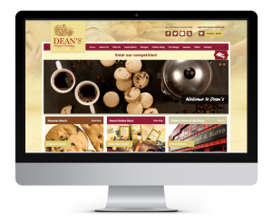
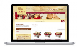
Last week, after less than three months of hard work and dedication, we were delighted to launch a site that is not only modern and visually appealing, but one which also maintains Dean’s traditional heritage and identity.
One of our main aims when building the new Dean’s site was to simplify the process for the admin staff and remove confusion for the customer.
Prior to launch, the site was split into three elements: content about the company, the shop, and the blog. The main issue was that each of these parts were completely different in look and feel, not to mention they each had separate domain names.
We wanted users to be able to land on any part of the site and navigate seamlessly from the main content to the online shop to the latest news section, all while having a consistent navigation.
It was also very important that Dean’s personnel could log in to one central location that would give them control over all elements of the site; something that we’ve managed to achieve with great success.
Stand out from the competition
Before beginning our design process, we looked at the analytics on the previous site and noticed a considerable amount of traffic from mobile devices and from older desktop machines.
So, in order to cater for the right markets, we had to make it responsive and ensure cross-browser compatibility as much as possible.
Not only that, we had to ensure that the site was scalable; whether we had 1 product or 1000 products, the site should feel just as approachable and manageable.
Design – Meetings, moodboards and meticulous planning
With all these ideas in mind, the design process began by having a meeting amongst ourselves and meticulously examining the good and bad parts of the existing site, which gave us an idea of what to keep and what to improve on.
From there, we created wireframes of the site, so that we had an idea as to what the customer journey would look like. Having created some moodboards to help express our ideas and vision for the site, we presented a considerable number of different designs, which varied in colour, element size and position – once this was approved, work commenced on building the site.
Development, details and devices
Looking at the site, there are subtle details such as using different graphics for mobile devices compared to the desktop equivalent, but regardless of which device you’re using, you won’t miss any of the key content.
Once the core site was complete, we integrated the ecommerce side of the business, and started to build the responsive element.
Testing the site then involved dummy purchases, awkwardly sized images, extra-long blog titles, poor networking conditions, and most importantly, feedback from Dean’s.
Finally, we moved the test site onto the live server, which involved some more testing to ensure that all elements were still working as expected.
From an SEO perspective, we made sure that old links were being permanently redirected to their new site equivalent, which ensures that all the work put into Dean’s SEO to date won’t be diminished.
Now that the site was completed, it was time to let people know about it. As we’re sure most of you will already know, we have worked with Dean’s on their social media management for the past two years – so we of course utilised social media.
However, rather than physically running the competition on Facebook or Twitter, we decided instead to run it on the website to drive traffic – thus far, we have received almost 3000 entries!
Thankfully, all the hours of hard work from both sides has thoroughly paid off, and we’re sure you’ll agree that the new website looks absolutely fantastic.
Please feel free to have a look around the site, and give us your feedback by either commenting on this blog post, or by getting in touch on Facebook, Twitter or LinkedIn.
And don’t forget to enter the competition to win a delicious Dean’s hamper – just in time for Christmas!
If you have found this post interesting please share it with your online community using either the Twitter, Facebook and Share buttons below. Thank you.


