Some of you may have noticed the change already, and for some it has still to come. However, everyone with a business page on Facebook will now have to adapt to the Facebook pages’ changes.
Thankfully, most differences are just aesthetic, but depending on your aims or expectations of your Facebook pages, you may have to modify your strategy or approach. Here are the main changes taking place, and how we can adapt:
Profile photo move
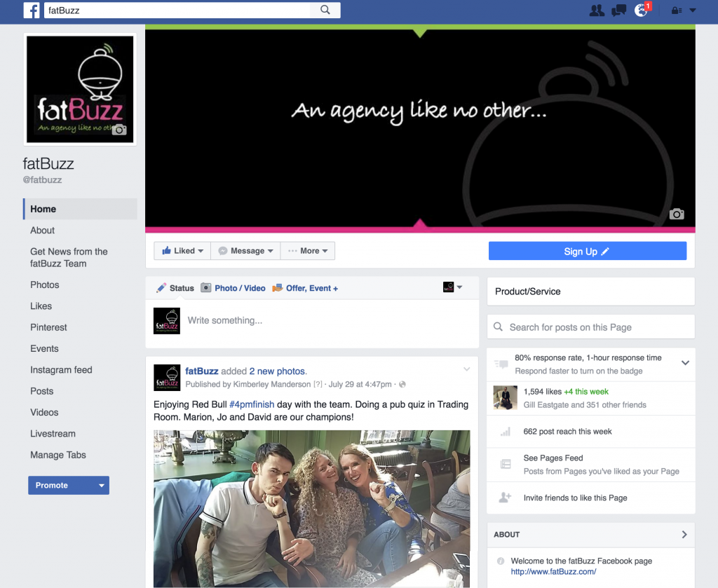
The profile photo for your business page has now moved to the left hand side, rather than overlaying the cover photo. This is great as it will take significantly less effort for businesses to ensure their message or image isn’t negatively obscured by their profile picture. However, those who embraced this layout and made matching profile and cover photos may need to rethink their designs. The dimensions of the image itself have also changed, making the picture slightly bigger.
More pronounced call to action
The call to action button has moved to the right hand side and has become predominantly larger than before. It’s also nice and blue, making it stand out from the rest of your page content. As a result, it’s never been more important to test and utilize the call to action button. Whether you’re sending people to a website, a sign up form or an app, make sure the button works as there’s now a better chance of fans clicking this.
Searchable posts
Within a business page, users (and admins!) are able to search for posts within the page. This is a great solution to the robust Facebook algorithm, as many people may find a great post from their favourite brand while they are quickly checking social media, without the time to interact or engage with it. This way, users are able to search your page for the information they were looking for, from a specific video you posted to the interesting thing you had to say about Wimbledon. Additionally, this could see engagement and reach for older posts increasing, depending on how users react to this search facility.
It’s all about the tabs
Your page tabs have now moved too. No longer displayed along the page underneath the cover, they have moved to the left hand column and display vertically. The great news is that all of your tabs are now displayed, as opposed to the previous layout where you were forced to choose your main tabs, offering a dropdown menu for the rest. This resulted in a lot of users not seeing or accessing all of the content you had to offer on your page.
Here’s an example of how the pages now look, taken from our own Facebook page:
